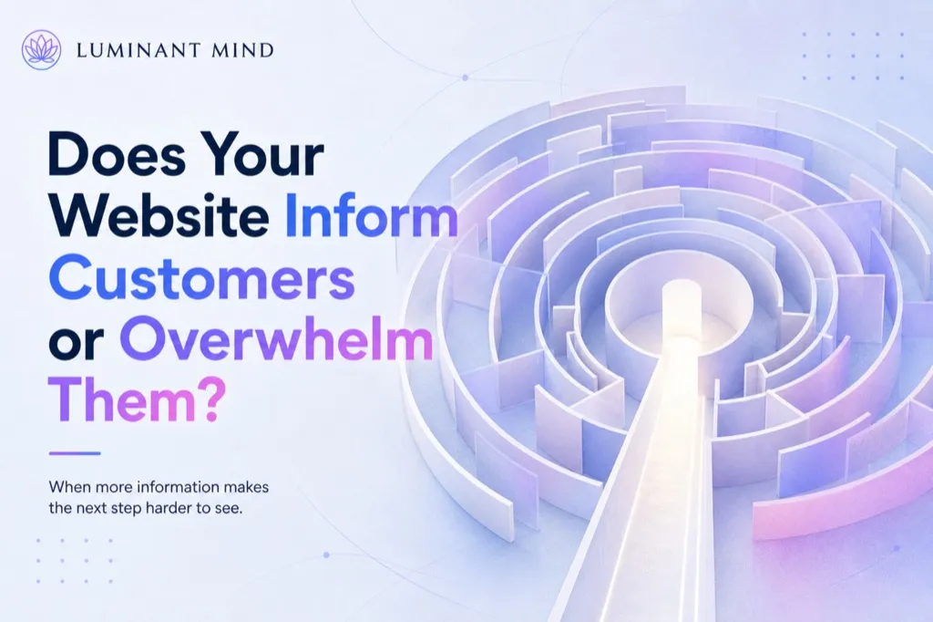
Does Your Website Inform Customers or Overwhelm Them?
More content does not automatically answer more questions. Without a clear order, a website can make a capable company look more complicated than it is.
In the previous article, we looked at the difference between explaining a service and showing its value.
Once businesses recognize that customers need more than a list of features, they often respond by adding more information. The homepage becomes longer. Every possible benefit is included. More services, examples, explanations, credentials and calls to action appear across the page.
The intention is reasonable. The company wants to answer questions and prove that it can be trusted.
Yet a visitor may finish reading with less certainty than they had before.
They have learned more about the business, but they still cannot tell which information matters most to their decision.
More information creates more work
Every additional section asks something from the visitor.
They need to decide whether to read it, how it relates to the previous section and whether it changes their understanding of the offer. When several messages appear with equal visual importance, the visitor must create the hierarchy for themselves.
A consulting firm may present:
- six service categories,
- four industries,
- several working methods,
- three pricing options,
- multiple case studies,
- company values,
- awards,
- partner logos,
- testimonials,
- a newsletter,
- two consultation offers.
Each element may be useful. Together, they can make the decision harder.
The visitor may begin asking:
- Which service applies to my situation?
- Do I need one solution or several?
- Where should I start?
- Which result is most important?
- Is the company specialized enough for my problem?
- Should I book a call or read more first?
The website has provided information without helping the person organize it.
Attention is selective
People rarely read a business website from beginning to end. They scan for signals that appear relevant to their immediate concern.
A visitor who is worried about poor-quality leads may notice a headline about conversion but ignore a section about branding. Someone considering a costly service may look for case studies, pricing information and an explanation of the process before reading about the company’s philosophy.
This selective attention helps people manage the amount of information available to them. It also means that the most important message cannot depend on the visitor reading every section in the intended order.
Users read only a limited portion of website content. Weak headlines, long blocks of text, complicated wording and important information placed too late make it even less likely that essential points will be noticed.
The company may believe that an answer is present somewhere on the page. From the customer’s perspective, an answer that is difficult to find may as well be missing.
Complex decisions need direction
A large amount of information is not always harmful. A medical procedure, financial service or long-term business agreement may require detailed explanations.
The difficulty usually comes from presenting everything at the same level and at the same time.
A potential client first needs enough information to recognize:
- what the company offers,
- whether it relates to their situation,
- what outcome it may support,
- why the provider appears credible,
- what the next step involves.
Once those questions are answered, they may want to examine the method, conditions, technical details or comparisons.
This reflects the two modes of processing introduced earlier in the articles. An initial evaluation helps the visitor decide whether the offer appears relevant and worth further attention. More deliberate analysis follows when the person begins comparing evidence, costs and possible consequences.
A website can support this natural progression by arranging information according to the stage of the decision.
Choice can become another source of uncertainty
Businesses often assume that more options will help them appeal to more customers. Sometimes they do. They may also create additional doubt.
Imagine a web-design company offering separate packages for strategy, branding, copywriting, UX, development, SEO, automation, maintenance and conversion optimization. A knowledgeable buyer may understand the distinctions. A less experienced client may have difficulty identifying what they actually need.
They may worry about choosing the wrong package or discovering later that an essential service was not included.
The number and complexity of available choices increase the effort required to make a decision. This applies to pricing plans, navigation menus, service categories and calls to action.
A company does not necessarily need to reduce its entire offer. It may need to guide the visitor more clearly.
For example:
“Not sure which service you need? Begin with a website review. We will identify the main problem and recommend the appropriate next step.”
This gives the customer a starting point without requiring them to understand the company’s full internal service structure.
Repetition can help, but duplication creates noise
Important ideas often need to appear more than once because visitors enter websites through different pages and rarely read content chronologically.
The value proposition may appear on the homepage, a service page and a relevant case study. This reinforces the central message and helps people who arrive at different stages of the journey.
Problems begin when repetition adds more versions of the same vague claim.
A website may say:
- We help businesses grow.
- We support sustainable business growth.
- We provide solutions that accelerate growth.
- Our approach is designed around your growth.
The language changes, but the visitor learns very little.
Useful repetition brings the same central message into different contexts. It may explain the promise, show it through an example and support it with evidence.
Structure gives information meaning
Good structure helps the visitor understand how individual details relate to the decision.
A service page might move through a sequence such as:
- the situation the customer recognizes,
- the result the service is intended to support,
- how the process works,
- evidence that the company can deliver,
- practical details,
- the next step.
The sequence should reflect the customer’s questions rather than the company’s organizational chart.
Visual hierarchy also matters. Headings, spacing, contrast and position show the reader what deserves attention first. When everything is emphasized, nothing provides direction.
A long page can still feel easy to navigate when its structure is clear. A short page can feel confusing when unrelated messages compete for attention.
Review what the customer needs now
When reviewing a website, it is useful to look beyond whether all important information has been included.
Ask:
- What does the visitor need to understand first?
- Which details help them make the next decision?
- Are we presenting information because the customer needs it or because the company wants to mention it?
- Do several services or calls to action compete with one another?
- Can people find deeper information when they are ready for it?
- Is the main message still visible after more content has been added?
A customer may need substantial detail before making a serious decision. They rarely need all of it in the same moment.
The website should help them move from one question to the next without losing sight of the reason they came.
When information has a clear order, it supports understanding. When it arrives without priorities, it can make a capable company appear more complicated than it really is.
This article draws on research in consumer psychology, cognitive science and evidence-based web design. The underlying studies are cited below.
Source: Iyengar & Lepper (2000), Journal of Personality and Social Psychology 79(6), 995–1006 · Miller (1956), Psychological Review 63(2), 81–97
Want to know where your own site stands?
We look at your site and send you an assessment with a score — 10 areas, with a reason given for each point.
- our own software, not a third-party tool
- evaluated locally in Austria
- analysis without third-party AI
- revocable at any time